Peasy App Design

The problem

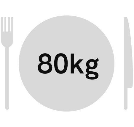
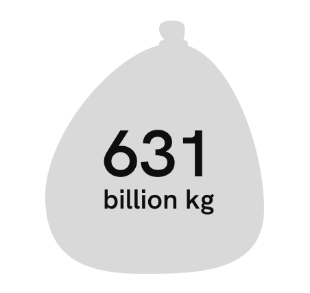
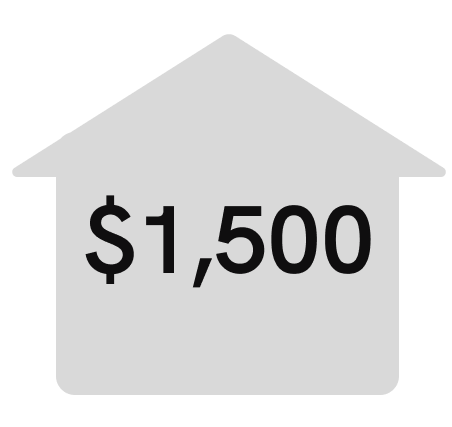
Today, each person throws away more than 200€ of food every year. In a family household, this rapidly increases to really big numbers that affect the household economy. Our daily lives are spent in a rush from one place to another, with no time to cook healthy meals, relying on fast food, making the food at home spoiled. Furthermore each person has their own diets and dietary needs that vary greatly from one person to the other.

To solve this issue, Peasy was created to help each person better organise their daily lives, and not worry about what they have in stock in their pantry, or what to eat. All this while eating healthy food and personalising meal plans to each person’s needs.

The process

Throughout the whole project we relied on UX research and investigation to make sure the addressed problems had a solution that was correct and necessary. Here some parts of our UX research that helped us.

What we learned

Some of the pain points we identified on our research about how the app was being conceptualised was the long onboarding process. The onboarding helps Peasy give you the recepies peronalised to your needs and kitchen. You no longer need to search for recepies that turn out to use kitchen uttensils that you don’t have, or use an ingredient you are allergic to. So the onboarding was esential to use full potential of our AI assistant. However the long process frustrated users.

The solution to this was to give the user some motivation to complete the process. The onboarding process is a personality test, and after completing it, you are assigned a vegetable depending on your awnsers. This gives the user motivation to complete the process. The status bar on the process also helps with the sense of advancement (the process has an end). And if the user has no time to complete the onboarding on the spot, they can alway skip it and fill the data on their account.

Registration and onboarding process

Other pain points

Apart from the obvious pain point of having a long onboarding, during the conceptualization phase we also realised we wanted to cater to too many different target audiences. If we kept adding functions that would please each target audience we envisioned at first, our app would have ended up being very confusing to use and have a great learning curve that we wanted to avoid.

To solve this we further specified our target audience (young persons learning to live alone for the first time), so we could cater better without making the app really confusing.

Architecture

In order to correctly develop the app and organise user flows we designed the app architecture. It underwent several corrections as errors came up in the user testing process.

Wireframes

It helpedus correctly organise and add hierarchy to the app. It also enabled us to test the MVP in user testing and correct some flows.

App prototype

Create recepies

View your recepie books

Next
Next

Departure Fest